General Settings
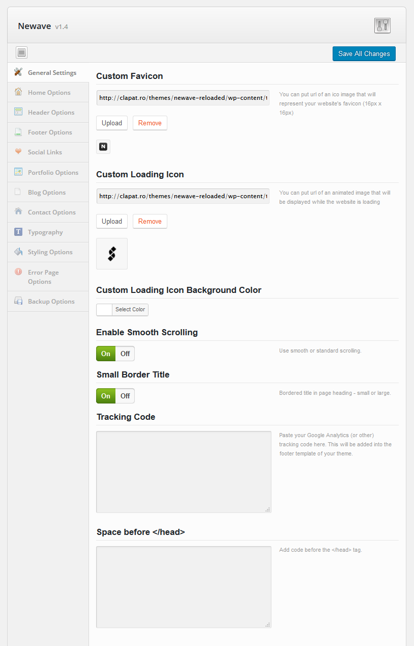
- Custom Favicon – your website favicon. Recommended size: 16X16 px
- Custom Loading Icon – animated image displayed while pages are loading
- Custom Loading Icon Background Color - specifies the background color displayed while pages are loading
- Enable Smooth Scrolling – enable or disable smooth vertical scrolling
- Small Border Title – bordered title in page heading - small or large
- Tracking Code – Google analytics (or other) tracking code
- Space before
[head]- Custom code to be added before the end of header tag[/head]
Home Options
These settings define the behaviour and structure of the home section page.
This is were you can create variations of your home section page. For more information about pages and sections please refer to Building the Main Page chapter in Creating Content There are five types of home sections and each of them comes with its own structure and settings.
Image Pattern
Has a background image pattern, a text(s) slider, list of texts separated by bullets and a button
- Image pattern background
- Show Html Page Content - displays the content of the home page as defined in the page editor
- Text Slider - series of texts displayed within a slider
- Text Slider Transition Type - fade or slide vertical
- Text Slider Speed
- Bullet Words
- Text Color
- Button name or caption
- Button URL
Full Screen Slider
Besides the slides, you can specify transition type (fade or horizontal) and speed. Each slide has the following attributes:
- Slide Image URL
- Text heading
- Text highlighted
- Text normal
- Text Color
- Button name or caption
- Button URL
Full Width Parallax Slider
Besides the slides, you can specify autoplay (on / off) and speed. Each slide has the following attributes:
- Slide Image URL
- Text heading
- Text highlighted
- Text normal
- Text Color
- Button name or caption
- Button URL
Full Screen Image Parallax
Has a background image with parallax effect, a text(s) slider, list of texts separated by bullets and a button:
- URL of the background image
- Show Html Page Content - displays the content of the home page as defined in the page editor
- Text Slider - series of texts displayed within a slider
- Text Slider Transition Type - fade or slide vertical
- Text Slider Speed
- Bullet Words
- Text Color
- Button name or caption
- Button URL
Full Screen Video Background
Has a background video, a text(s) slider, list of texts separated by bullets and a button:
- Video background URL
- Show Html Page Content - displays the content of the home page as defined in the page editor
- Text Slider - series of texts displayed within a slider
- Text Slider Transition Type - fade or slide vertical
- Text Slider Speed
- Bullet Words
- Text Color
- Button name or caption
- Button URL
Full Screen Moving Background
Has a background image which can move perpetually, a text(s) slider, list of texts separated by bullets:
- Image background URL
- Show Html Page Content - displays the content of the home page as defined in the page editor
- Text Slider - series of texts displayed within a slider
- Bullet Words
- Text Color
- Moving Direction - horizontally, vertically or in diagonal
- Scroll Speed - the speed image background moves: normal or slow
- Background Repeat - use image as a repeated pattern or as a whole image
- Bouncing Arrow URL - the url of the moving arrow underneath the text sliders
- Image Overlay Color
- Image Overlay Opacity
Full Screen Overlay Slider
Besides the slides, you can specify slider transition type and slider speed. The html content of the page will be overlaid on top of the slider:
- Images Included In Slider
- Show Html Page Content - displays the content of the home page as defined in the page editor
- Full Screen Overlay Slider Transition Type
- Full Screen Overlay Slider Speed
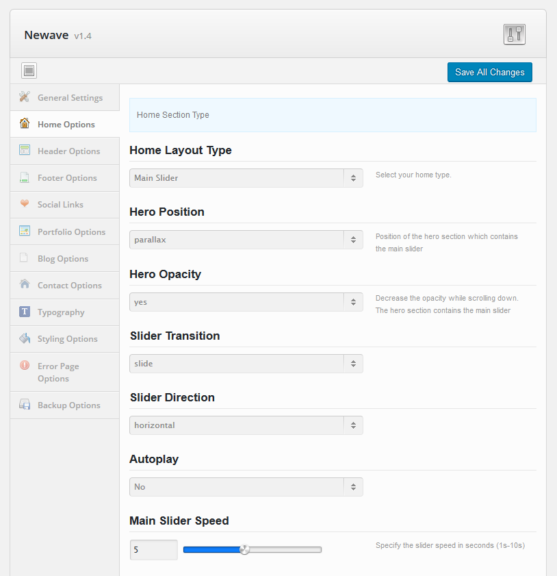
Main Slider
Displays the Main Slider as home section. Main Slider is described in detail in Creating Content section. Every slide has an overlay color, opacity and 9 caption alignments:
- Hero Position - position of the hero (or home) section which contains the main slider: normal, static or parallax
- Hero Opacity - decrease the opacity while scrolling down.
- Slider Transition - slide effect: fade or slide
- Slider Direction - horizontal or vertical
- Autoplay
- Slider Speed
Header Options
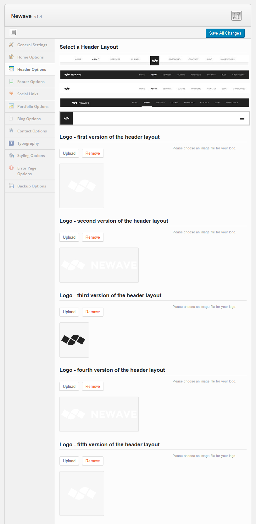
- Header layout – four types of header layout you can choose from. Each version requires a different logo (which may be different is size and colors). See below.
- Logo for the first header layout – the logo displayed in the first version of the header layout
- Logo for the second header layout – the logo displayed in the second version of the header layout
- Logo for the third header layout – the logo displayed in the third version of the header layout
- Logo for the fourth header layout – the logo displayed in the fourth version of the header layout
Footer Options
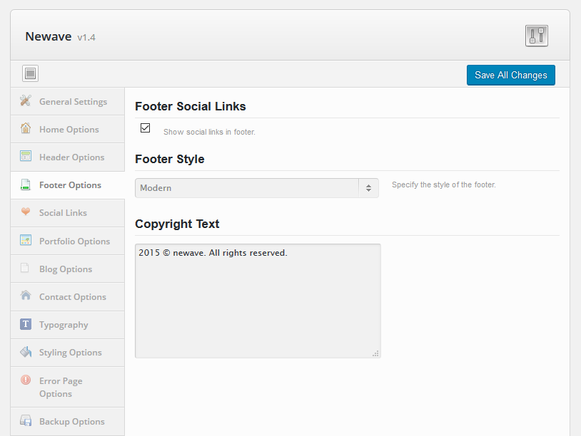
- Footer Social Links – hides or shows the social icons in the footer. Define social links in the Social Links options (see below)
- Footer Position – Normal (will show all the time) or Hidden (will hide when you scroll over)
- Copyright Text – copyright displayed in the footer
Social Links
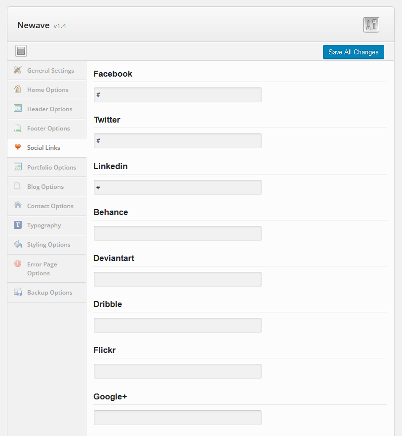
- Full URLs to social media sites. If specified, their icons are displayed in the footer.
Portfolio Options
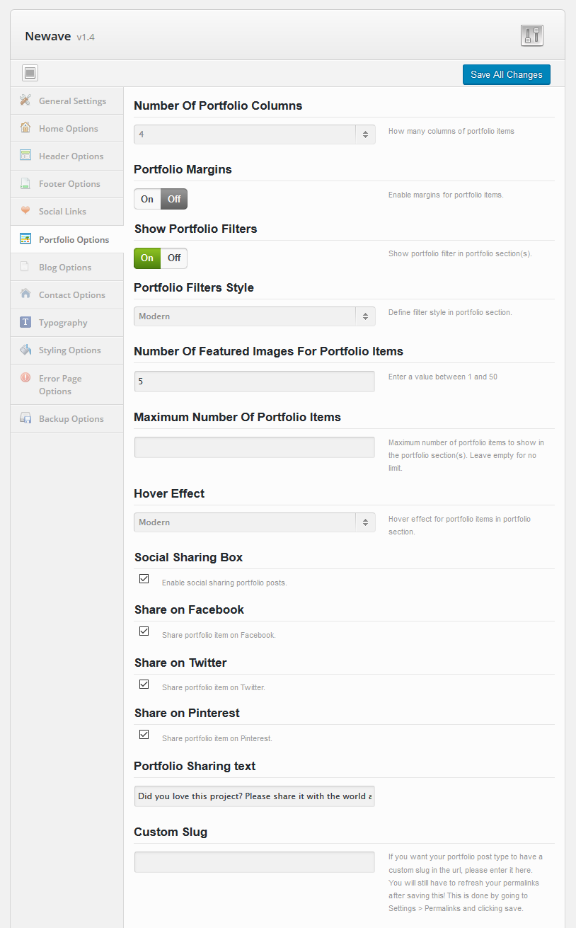
- Number of portfolio columns - the number of portfolio items columns displayed in the portfolio sections
- Portfolio Margins - enables margins for portfolio thubnails in portfolio section
- Show Portfolio Filters - hides or shows the portfolio item filters in main page sections designated as Portfolio. Filters are used to display only certain portfolio items based on their categories. For more information about Sections and Main Page please read >>Building the Main page
- Portfolio Filters Style - defines filter style in portfolio section (normal or modern).
- Number Of Featured Images For Portfolio Items - the number of featured images allowed for a portfolio item. Value between 1 and 50.
- Maximum Number Of Portfolio Items - maximum number of portfolio items displayed in the Portfolio section. This value is ignored in case of Portfolio page templates
- Hover Effect - Overlay (the portfolio name and categories overlays the thumbnail), Slide (will slide half-width thumbnail image) or Modern
- Social Sharing Box - hides or shows the likes count and social sharing links related with a portfolio project. This box is available only on portfolio pages defined as external (opens in a page instead of expanding in the main page).
- Share on Facebook - if Social Sharing Box is enabled, shows the facebook share button in portfolio external pages.
- Share on Twitter - if Social Sharing Box is enabled, shows the tweet button in portfolio external pages.
- Share on Pinterest - if Social Sharing Box is enabled, shows the pinterest share button in portfolio external pages.
- Portfolio Sharing Text - the text displayed underneath the Social Sharing Box.
- Custom Slug - the portfolio slug. By default, the slug is newave_portfolio. You will still have to refresh your permalinks after saving this value. This is done by going to Settings > Permalinks and clicking save.
Blog Options
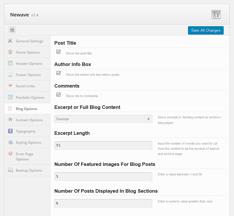
- Post Title – shows or hides post titles
- Author info box – shows or hides author info
- Comments – shows or hides comment box in the blog page
- Excerpt or full blog content - show excerpt or full content in blog pages
- Excerpt length – number of characters displayed in the excerpt
- Number Of Featured Images For Blog Posts - the number of featured images allowed for gallery blog posts. Value between 1 and 50.
- Number Of Posts Displayed In Blog Sections - how many posts are being displayed in the blog sections of the one pager
Contact Options
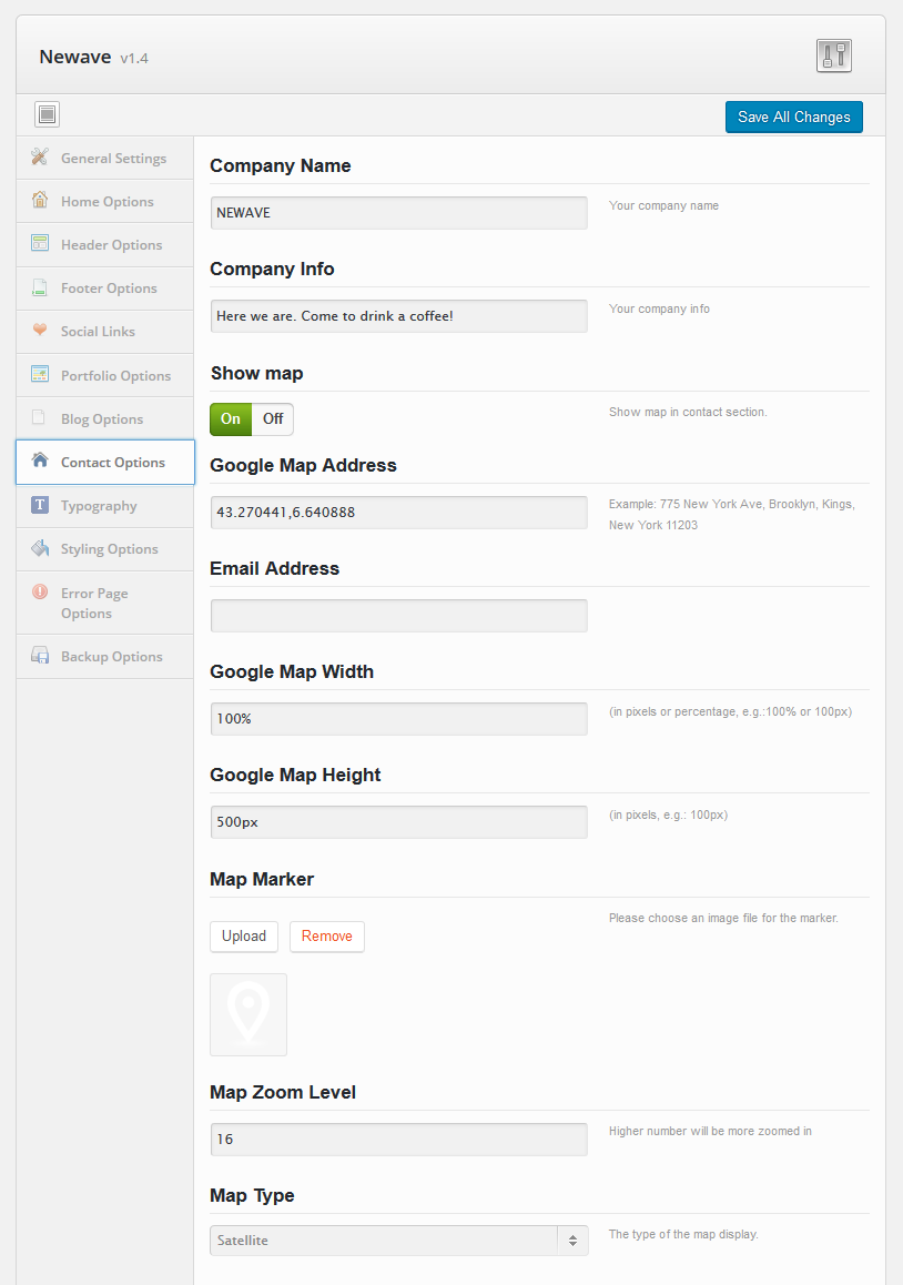
- Company section – company name and description, email address of your organization
- Show map - show the google map in the pages defined as Contact Sections. For more information regarding main page sections please read >>Building the Main Page
- Google map address
- Google map width
- Google map height
- Map marker
- Map zoom level
- Map type: roadmap or satellite
Typography
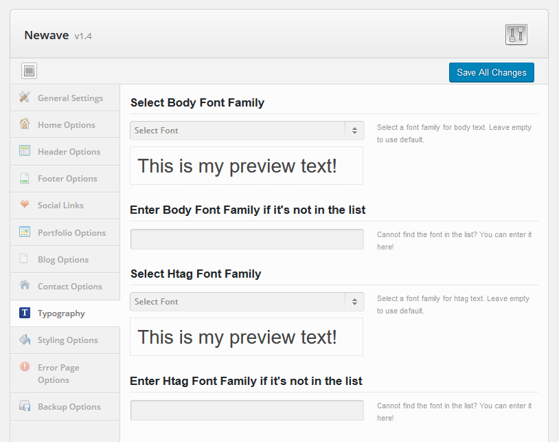
- Body font family – font family for body text with their preview
- Htag font family – font family for htag text with their preview
Styling Options
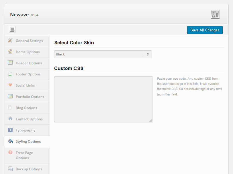
- Color Skin - defines the color skin used by the theme. Choose Custom Color if you want to define one of your own.
- Custom Color - define color used by the theme as custom skin.
- Custom CSS - input CSS code to overwrite theme's styles or add new ones.
Error Page Options
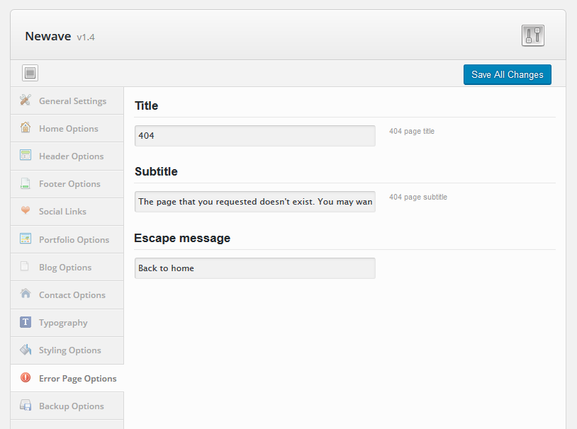
- The title displayed in the error (404) page
- Error Message
- Back To Home Page caption - the message displayed with the 'Back to website' button.
Backup Options
Section helping you with import and backup options
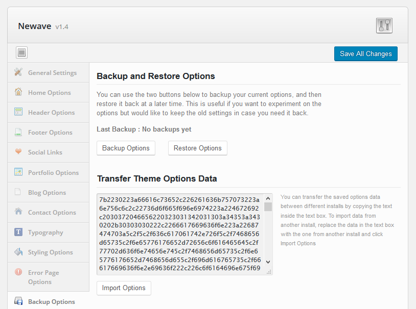
- Imports, saves or restores your theme options
- Backup theme options