Page Templates
Villar categorizes pages depending on their settings and templates. These page templates are:
- Default - This is the default template. The layout of a default page includes a hero section followed by page content and the footer panel.
- Blog - A page containing all blog posts. Apart from the page options, additional settings about this template can be found in Theme Options » Blog Options
- Contact - A page containing map address and company information. Apart from the page options concerning this template, additional settings about this template can be found in Theme Options » Map Options
- Portfolio - This page displays all the Villar portfolio items. Apart from the page options concerning this template, additional settings about this template can be found in Theme Options » Portfolio Options
- Portfolio Mixed - This page displays all the Villar portfolio items, but it will display the page content underneath so that you can have a page with different set of sections.
You can limit also through page options how many portfolio items are being displayed.
Apart from the page options concerning this template, additional settings about this template can be found in Theme Options » Portfolio Options - Showcase - This page the showcase slider. The slides are defined separately and besides background image they have title and category overlaid on top.
Page Options
Page options are divided in five groups: all page templates (General), Default template, Portfolio template(s), Showcase template and only Contact Template
General Options
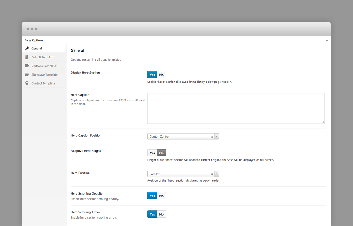
- Display Hero Section – A hero is the header section of the page displaying html content. For Hero settings please refer to Hero Section. Disable it for no hero header.
Default Template Options
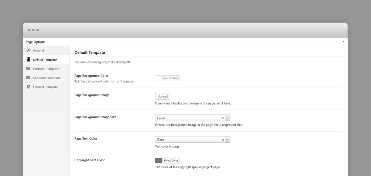
- Page Background Color – A background color for this page.
- Page Background Image – A background image for this page.
- Page Background Image Size – If page background image is set, the background size: cover (scales the background image to be as large as possible so that the background area is completely covered by the background image. Some parts of the background image may not be in view within the background positioning area) or contain (scales the image to the largest size such that both its width and its height can fit inside the content area)
- Page Text Color – Text color in the page.
- Copyright Text Color – Copyright text color in this page.
Portfolio Template Options
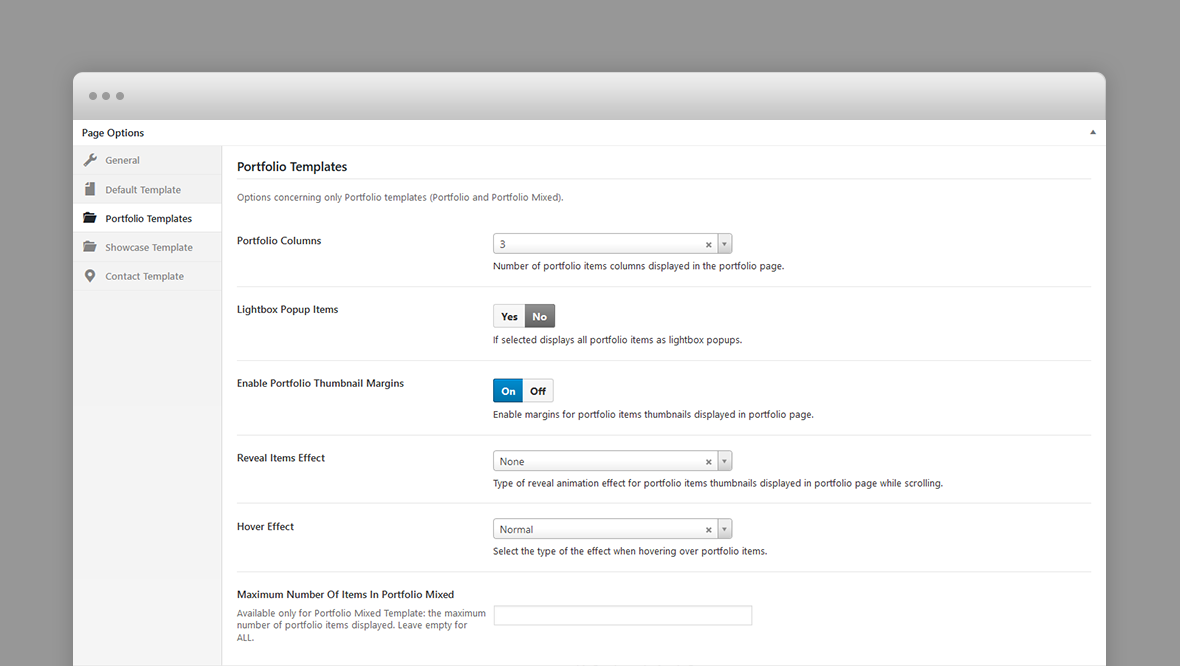
- Portfolio Columns – Number of portfolio items columns displayed in the portfolio page.
- Lightbox Popup Items – If selected displays all portfolio items as lightbox popups.
- Enable Portfolio Thumbnail Margins – If portfolio items are displayed with margins.
- Hover Effect – Type of hover effect over portfolio items thumbnails displayed in the portfolio page.
- Reveal Items Effect – Type of reveal animation effect for portfolio items thumbnails displayed in portfolio page while scrolling.
- Maximum Number Of Items In Portfolio Mixed – Available only for Portfolio Mixed Template: the maximum number of portfolio items displayed. Leave empty for ALL.
Showcase Template Options
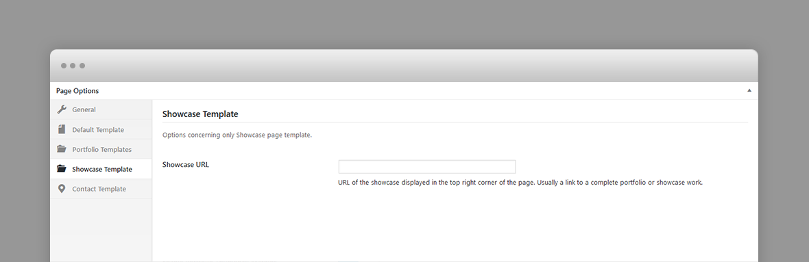
- Showcase URL – URL of the showcase displayed in the top right corner of the page. Usually a link to a complete portfolio or showcase work.
Contact Template Options
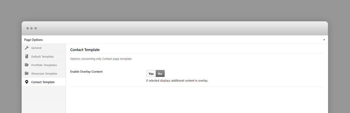
- Enable Overlay Content – If selected displays additional html content in the overlay screen.
Portfolio Post Options
Every portfolio item will be included in the portfolio page templates as long as they have a featured image, so, ideally, each item will have a featured image. The featured image will be displayed as the portfolio item thumbnail.
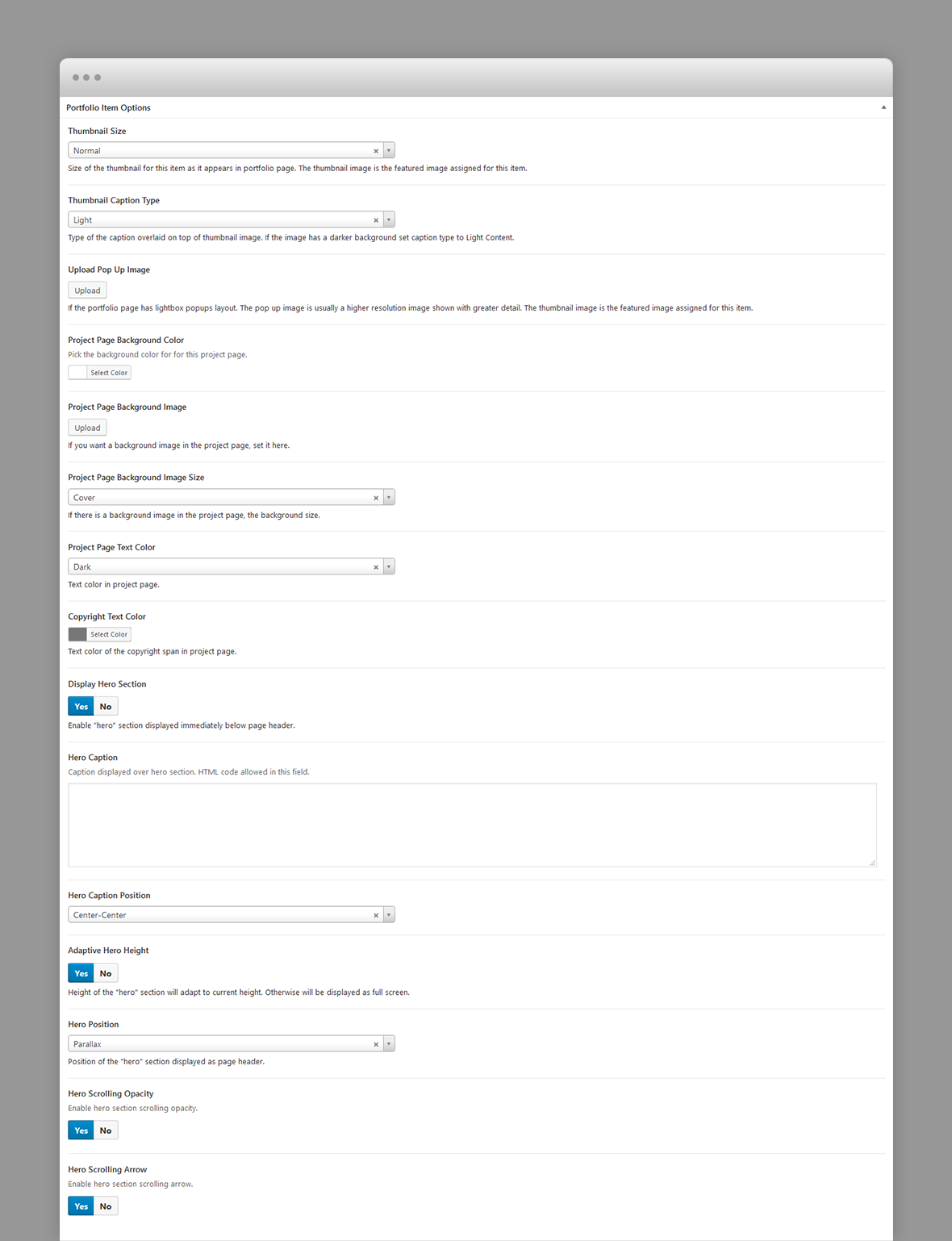
- Thumbnail Size – Size of the thumbnail for this item as it appears in portfolio page. The thumbnail image is the featured image assigned for this item.
- Thumbnail Caption Type – Type of the caption overlaid on top of thumbnail image. If the image has a darker background set caption type to Light Content.
- Pop-up image – If the portfolio page has lightbox popups layout. The pop up image is usually a higher resolution image shown with greater detail. The thumbnail image is the featured image assigned for this item.
- Project Page Background Color – A background color for this page.
- Project Page Background Image – A background image for this page.
- Project Page Background Image Size – If page background image is set, the background size: cover (scales the background image to be as large as possible so that the background area is completely covered by the background image. Some parts of the background image may not be in view within the background positioning area) or contain (scales the image to the largest size such that both its width and its height can fit inside the content area)
- Project Page Text Color – Text color in the page.
- Copyright Text Color – Copyright text color in the project page.
- Display Hero Section – A hero is the header section of the page displaying html content. For Hero settings please refer to Hero Section. Disable it for no hero header.
Blog Post Options
- Hero Caption Position – The "hero" is the section displayed right below page header. The caption is the post title and its categories.
- Hero Position – static, relative or parallax.
- Adaptive Hero Height – if set, height of the "hero" section will adapt to current height. Otherwise will be displayed as full screen.
- Scrolling Opacity
Hero Section
A hero is the header section of a page, post or portfolio item page displaying html content.
You can add any overlaying html content using Hero Caption field.
If there is no hero section, disable it in the page options
Hero Options

Each hero section has the following options:
- Hero Caption – Caption displayed over hero section. HTML code allowed in this field.
- Hero Position – static, relative or parallax.
- Adaptive Hero Height – if set, height of the "hero" section will adapt to current height. Otherwise will be displayed as full screen.
- Scrolling Opacity
Shortcodes
Villar comes pre-packed with a number of shortcodes allowing you to add styled content to your site with little effort. Villar is tightly integrated with Visual Composer editor, therefore you will see them when adding a new element.

The shortcodes are grouped in several categories:
- Typo Elements – Title, Line Divider, Button, Space Between Buttons
- Elements – Accordion, Toggle, Alert Box, Progress Bars, Pricing Table, Counters, Radial Counters, Icon Service
- Sliders - Normal Image Slider
If you choose not to install Visual Composer, conveniently, the available shortcodes have been included in a menu and shortcode editor. When creating a page or post, click the black H icon in the tinymce editor to reveal a list of shortcodes

WPML Compatible
Translating theme options
Follow the WPML configuration file shipped with the theme to see which options are translatable and which are not. You can add or change the properties of the fields. The theme options can be found in /include/admin-config.php. The metabox options can be found in /include/metabox-config.php
Theme Translation
Villar is fully localized and it has included the generated PO (Portable Object) in /languages folder. It contains all the translatable strings used by the theme.
Please visit the following links to learn more about translating WordPress themes: